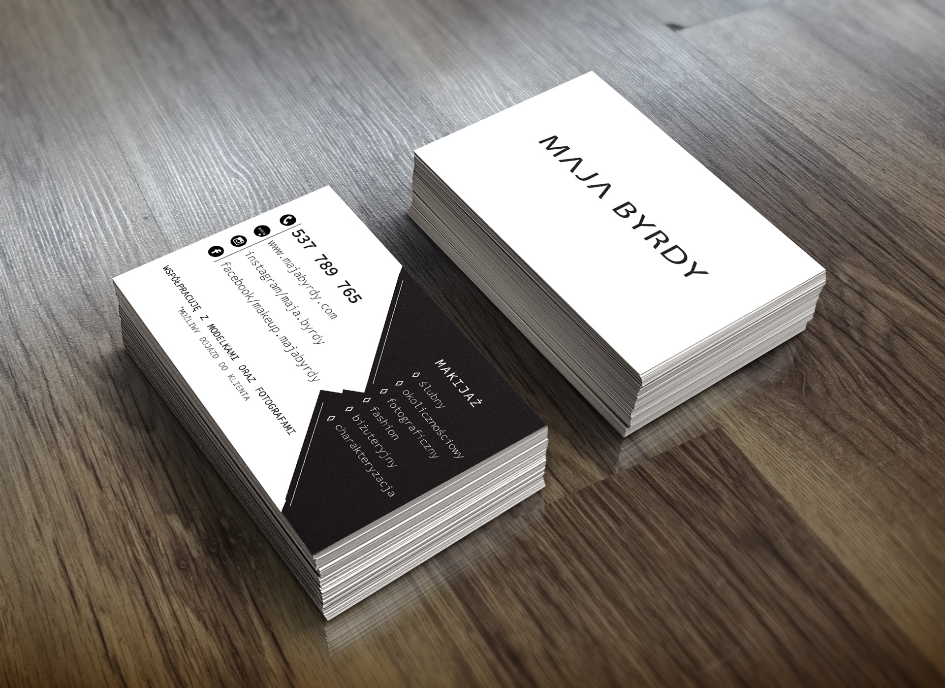
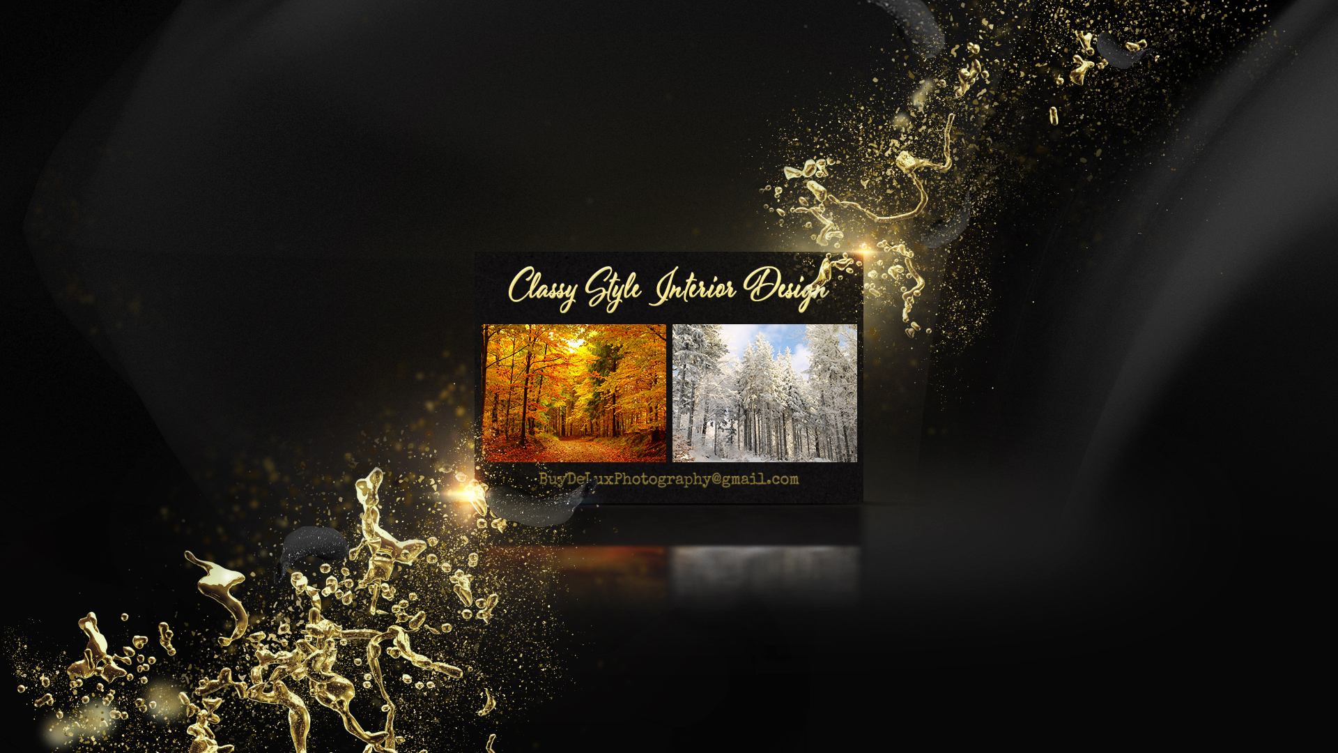
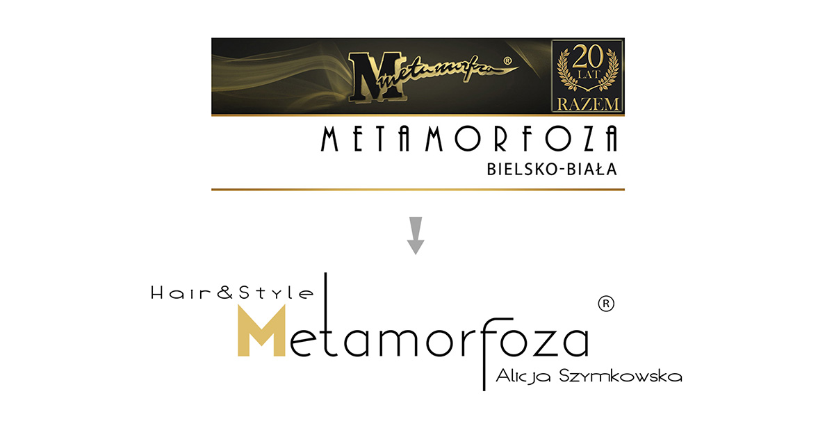
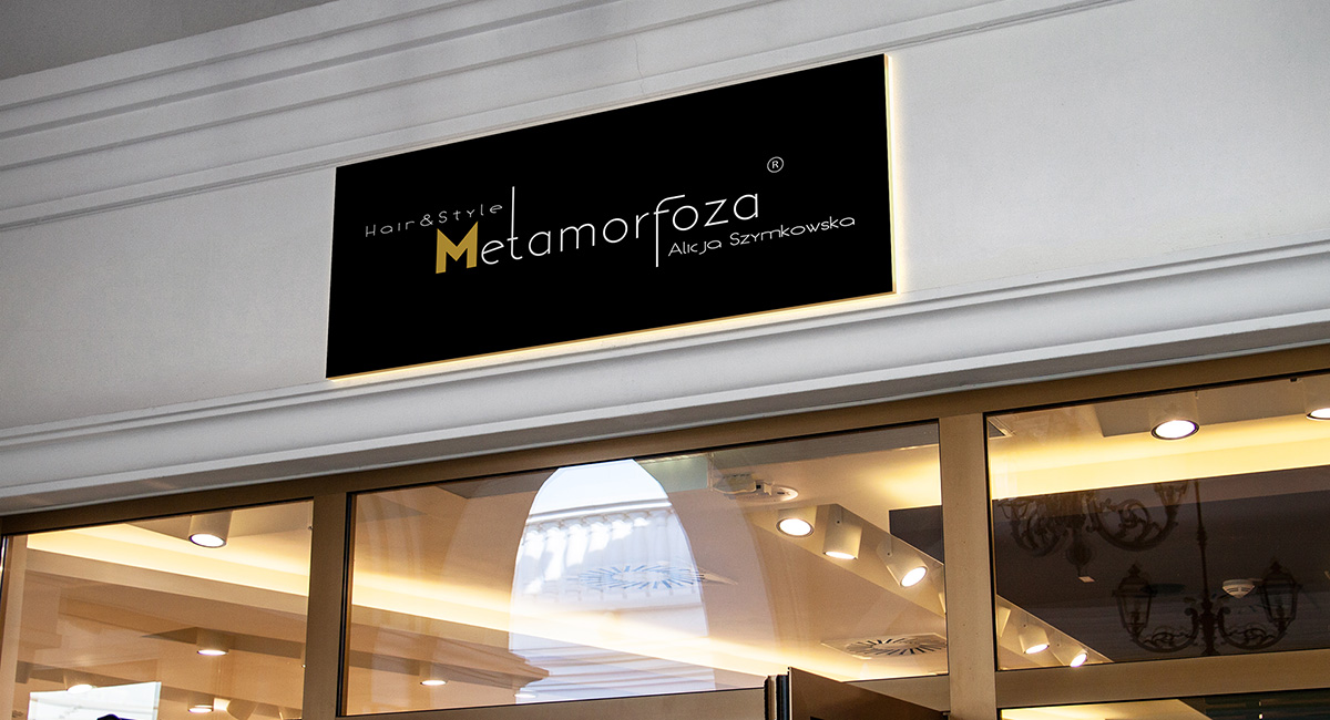
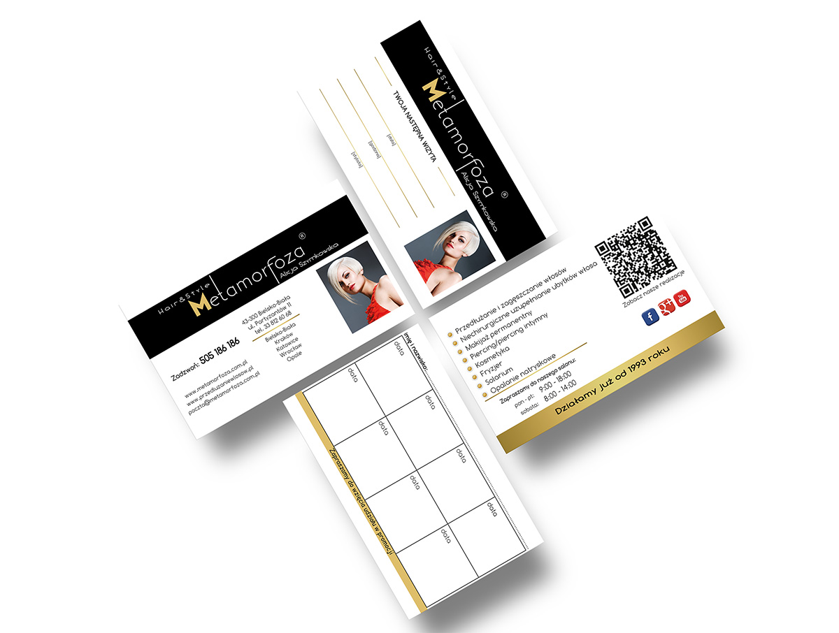
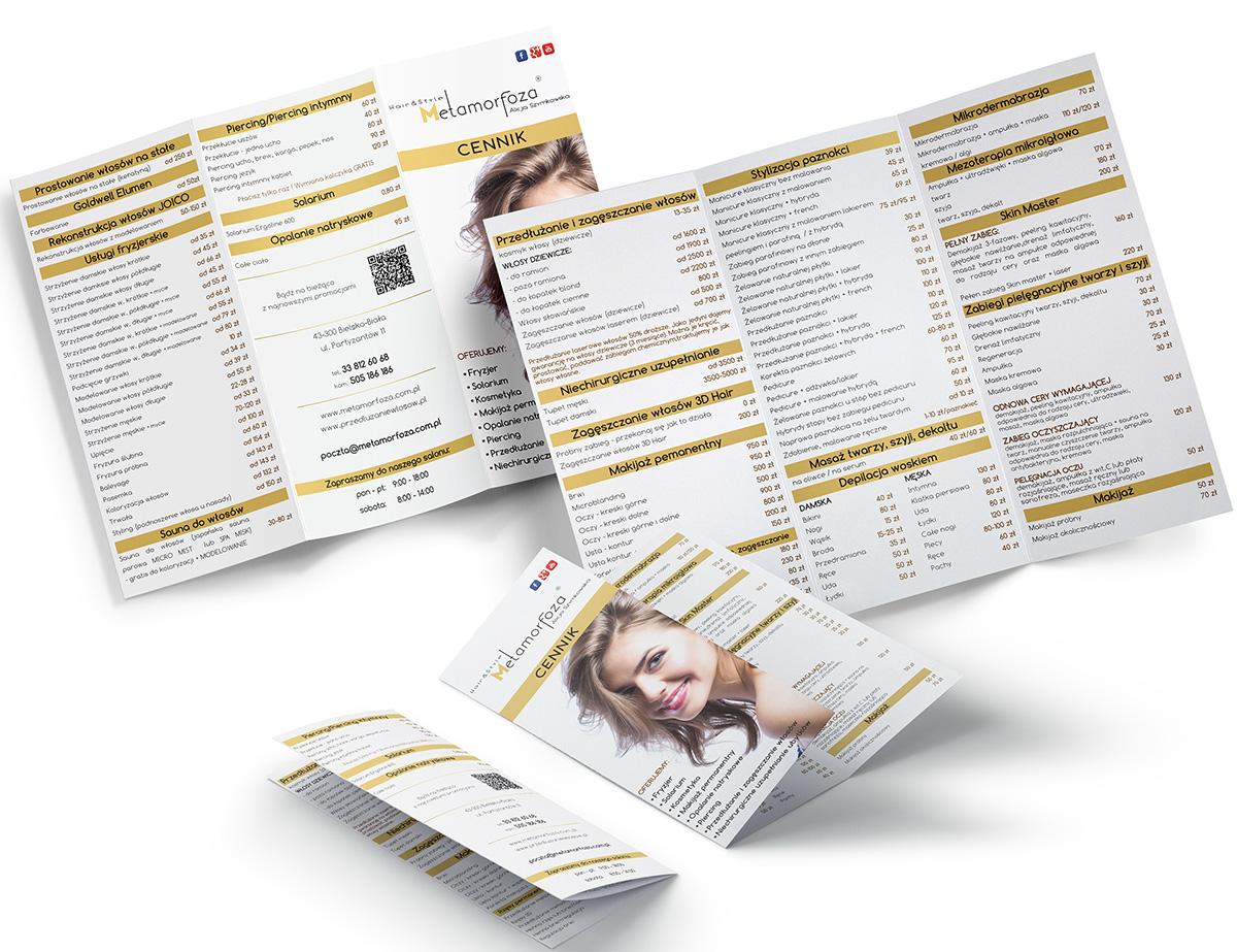
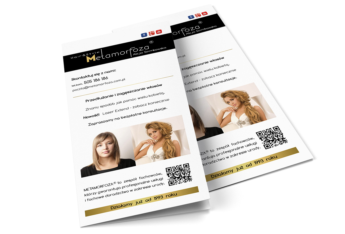
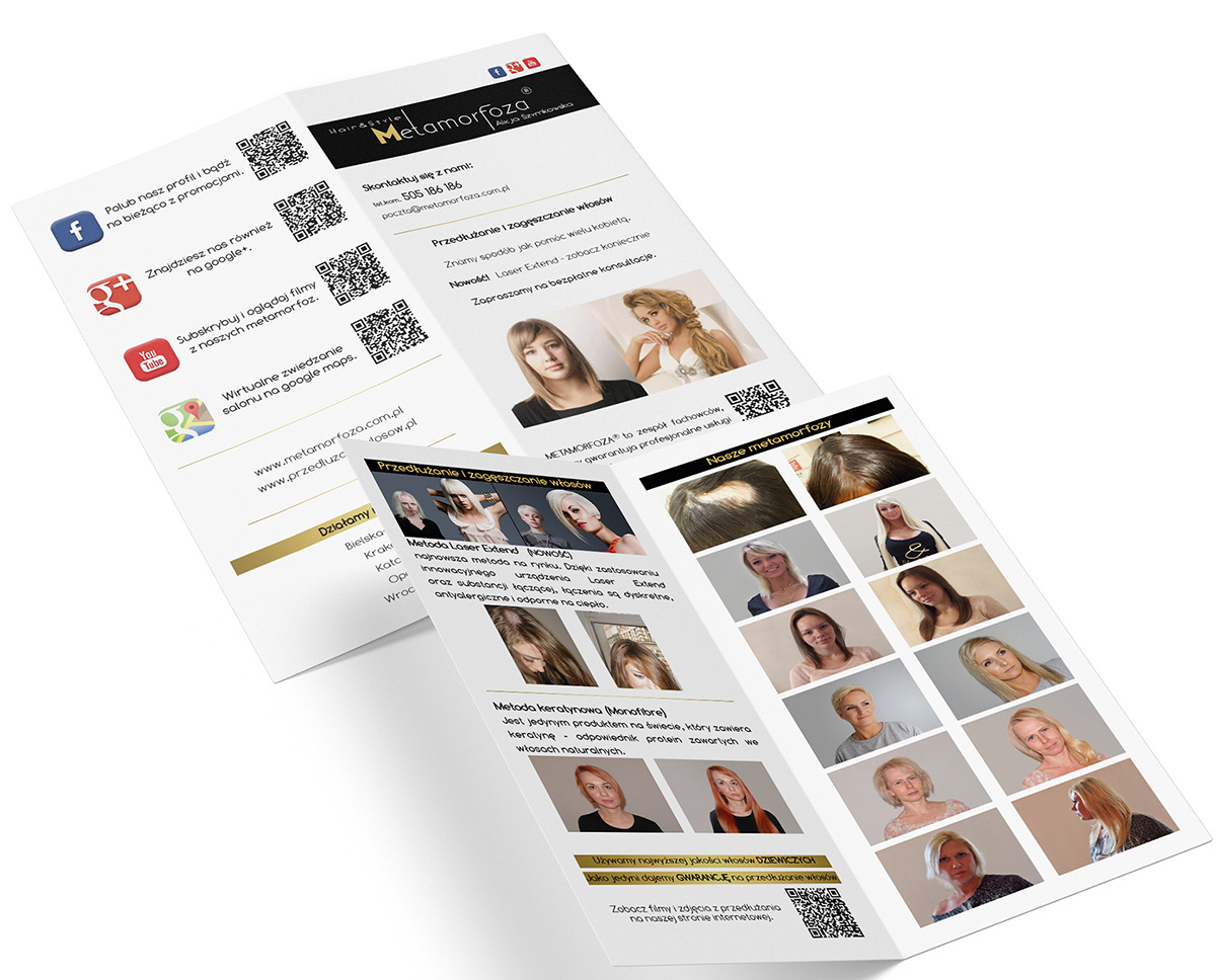
An example of the fact that quantity and quality do not count. You do not need thousands of business cards, but do you want them to be unique? This time it was a service - full gold-plating, UV, skin touch foil. Everything to get the WOW effect.


An example of the fact that quantity and quality do not count. You do not need thousands of business cards, but do you want them to be unique? This time it was a service - full gold-plating, UV, skin touch foil. Everything to get the WOW effect.


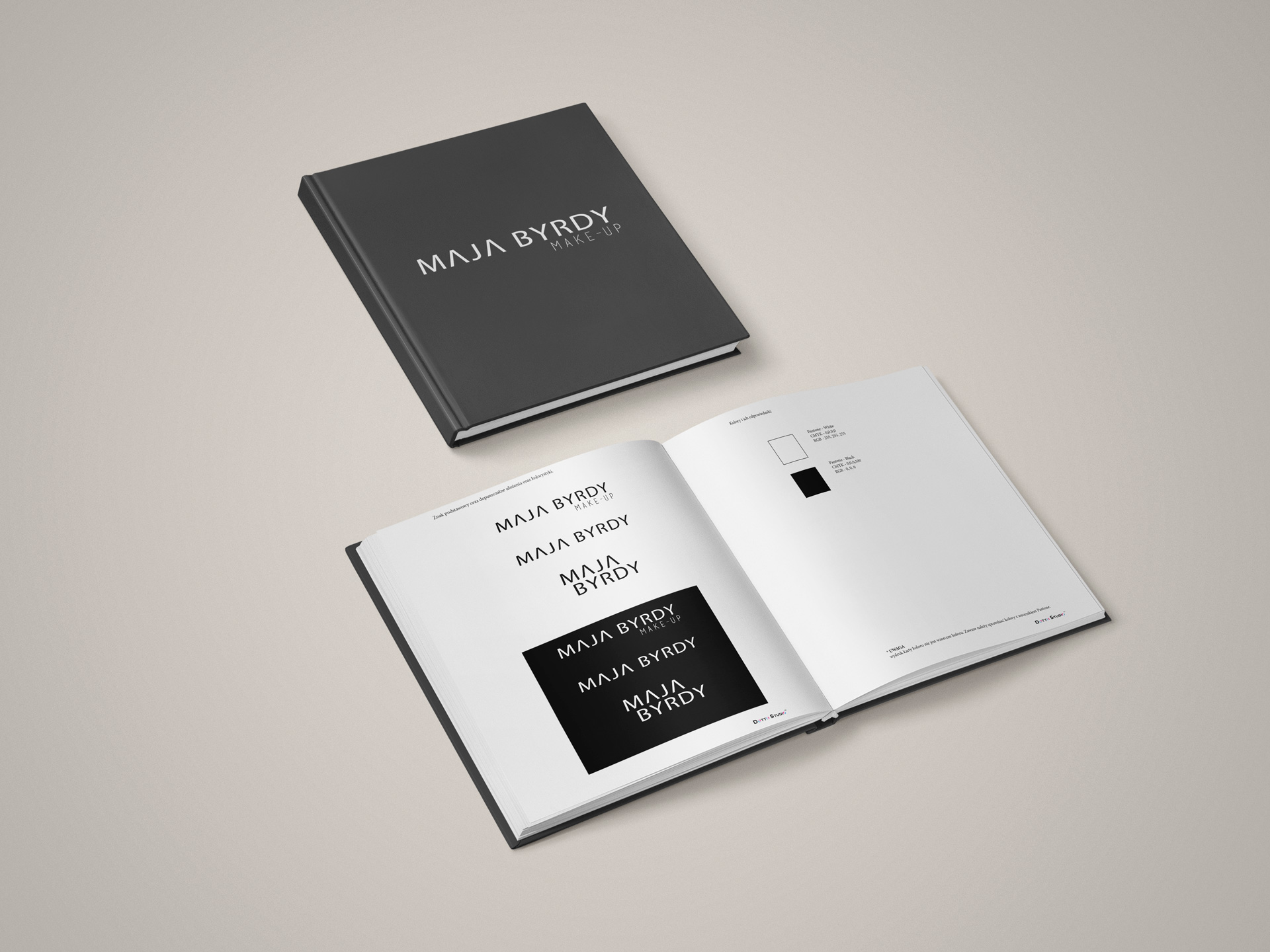
Kosmetologia medyczna jako dziedzina popularna w dzisiejszych czasach także potrzebuje reklamy. Stworzyliśmy na początek współpracy proste według wytycznych klientki. Miało być prosto i w czarno-bieli i tak też się stało. Nieodłączną częścią każdego loga jest księga znaku chodźby ta bardzo podstawowa. Ułatwia to prace na dalszych etapach gdyż wszystko zebrane jest w jednym miejscu i nawet osoba nie pracująca od początku z projektem wie co i jak ma być umieszczone.

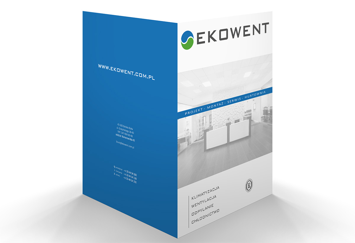
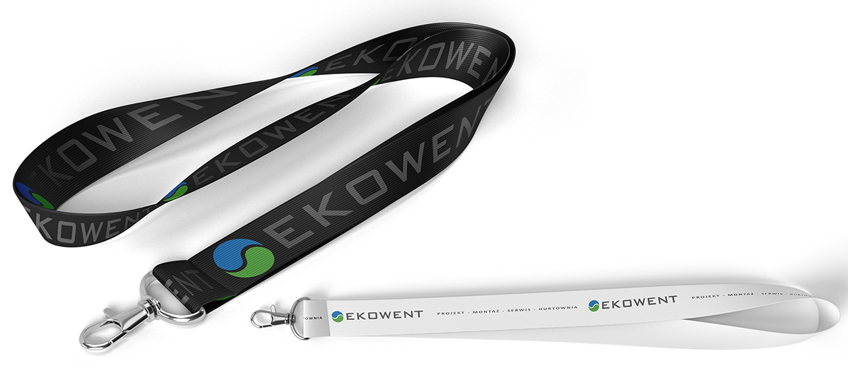
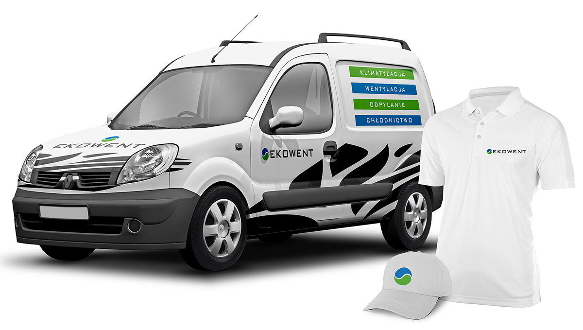
Rebranding is never a simple matter. Ekowent sp.j. (general partnership) is a company dealing with the delivery, installation and service of modern ventilation, air conditioning, refrigeration and dust extraction systems. The company also sells equipment and materials for air conditioning and ventilation.
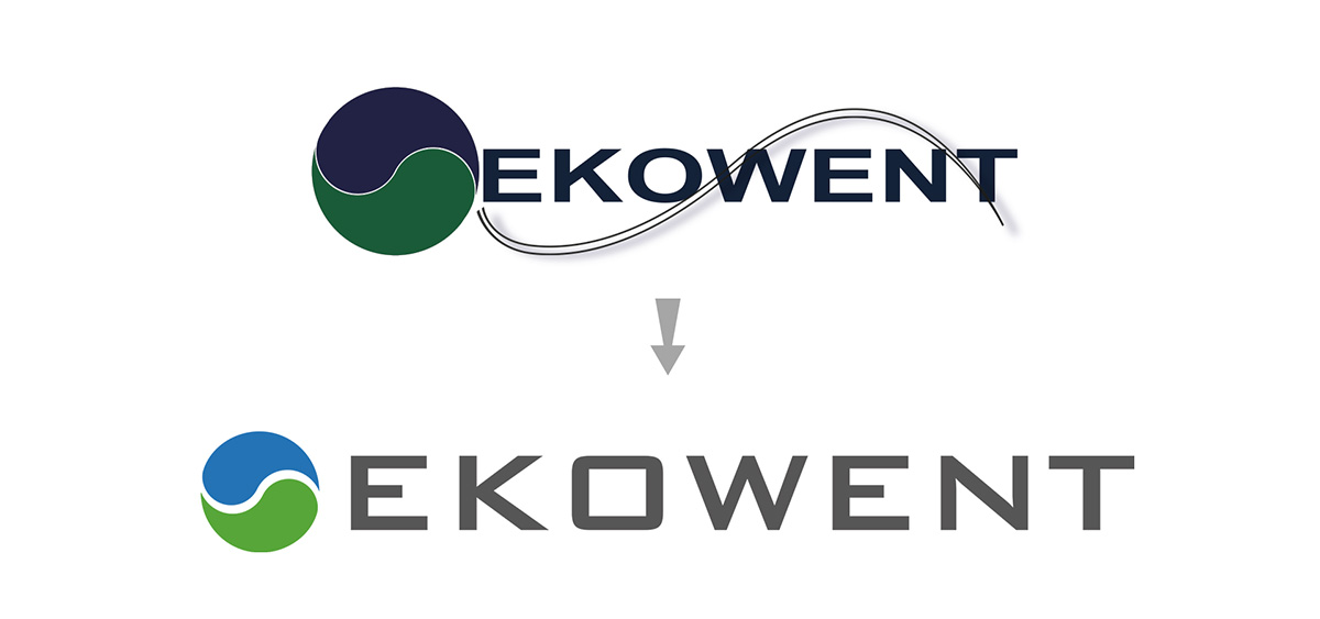
Since this company has been on the market for 20 years and has a significant position, the entire rebranding process has to be carried out in a very gentle manner so as not to violate the company's statute.
We did not want to completely change the
visual identity, but just give it a breath of freshness.
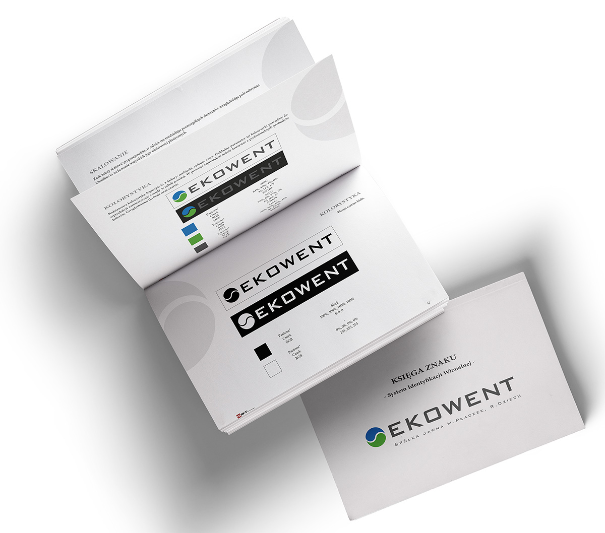
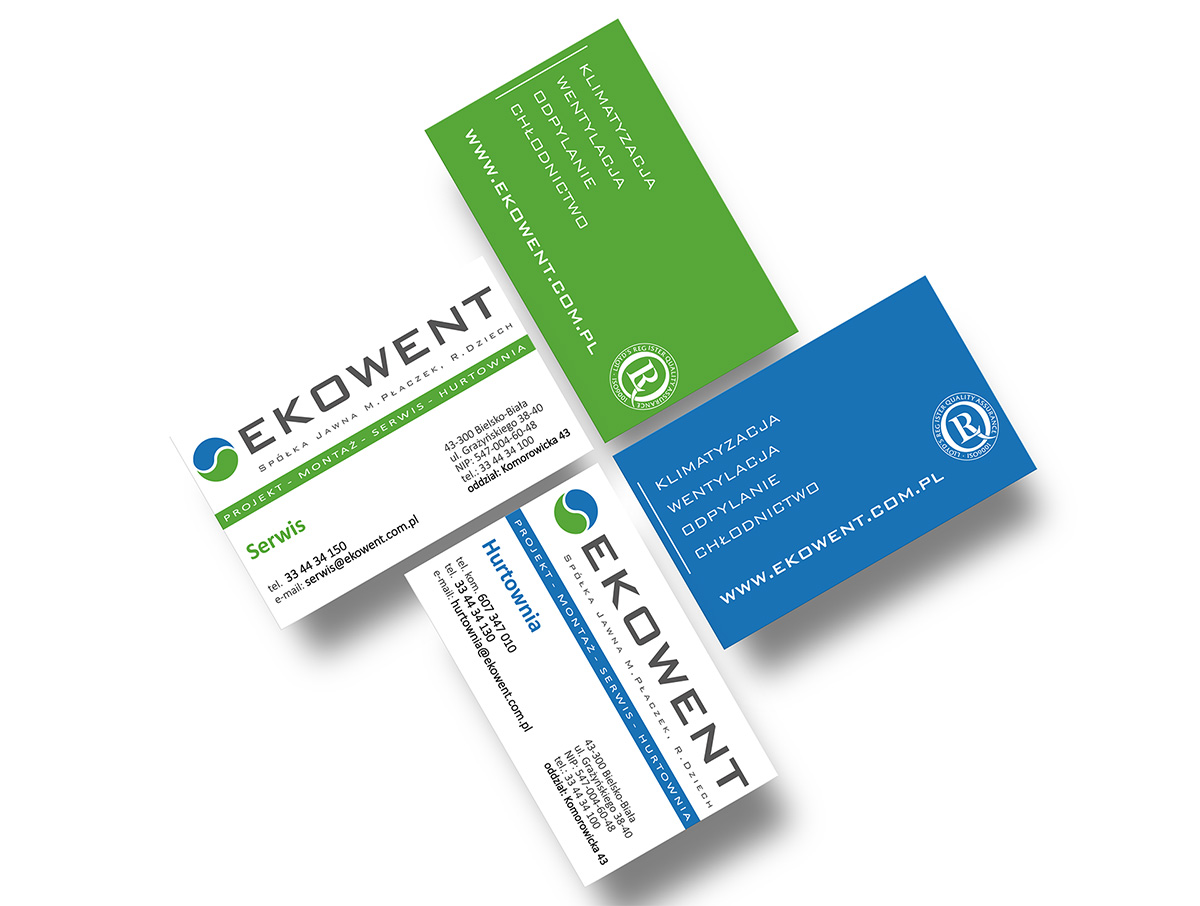
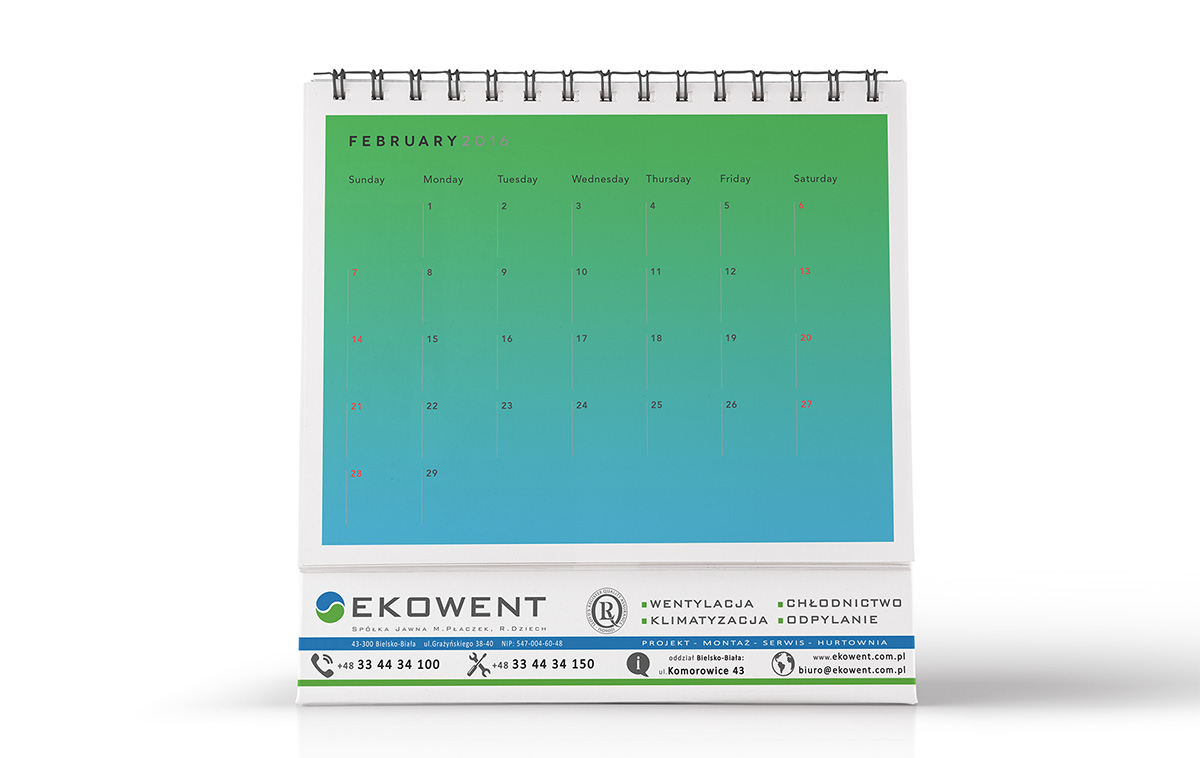
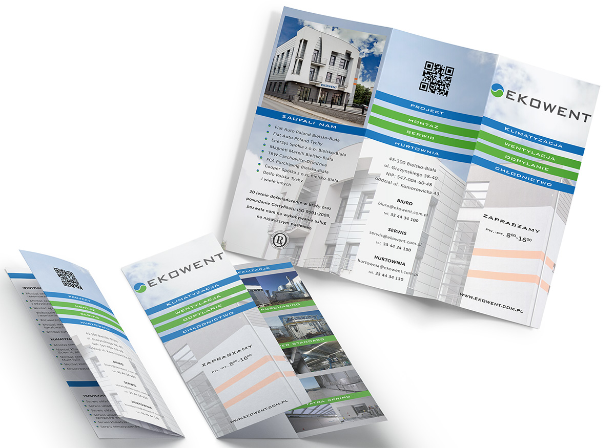
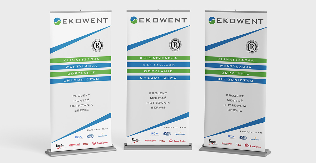
The Ekowent logo combines many features such as freshness, modernity, and experience, so it was obvious that the colors need to be maintained to represent these values - green, blue and gray. In addition, the signet refers to the philosophy of yin yang - complementing modern technology with the need to respect nature. Having been asked for full rebranding, we have created a complete brand book and a variety of corporate and advertising materials. Further projects are already being planned.


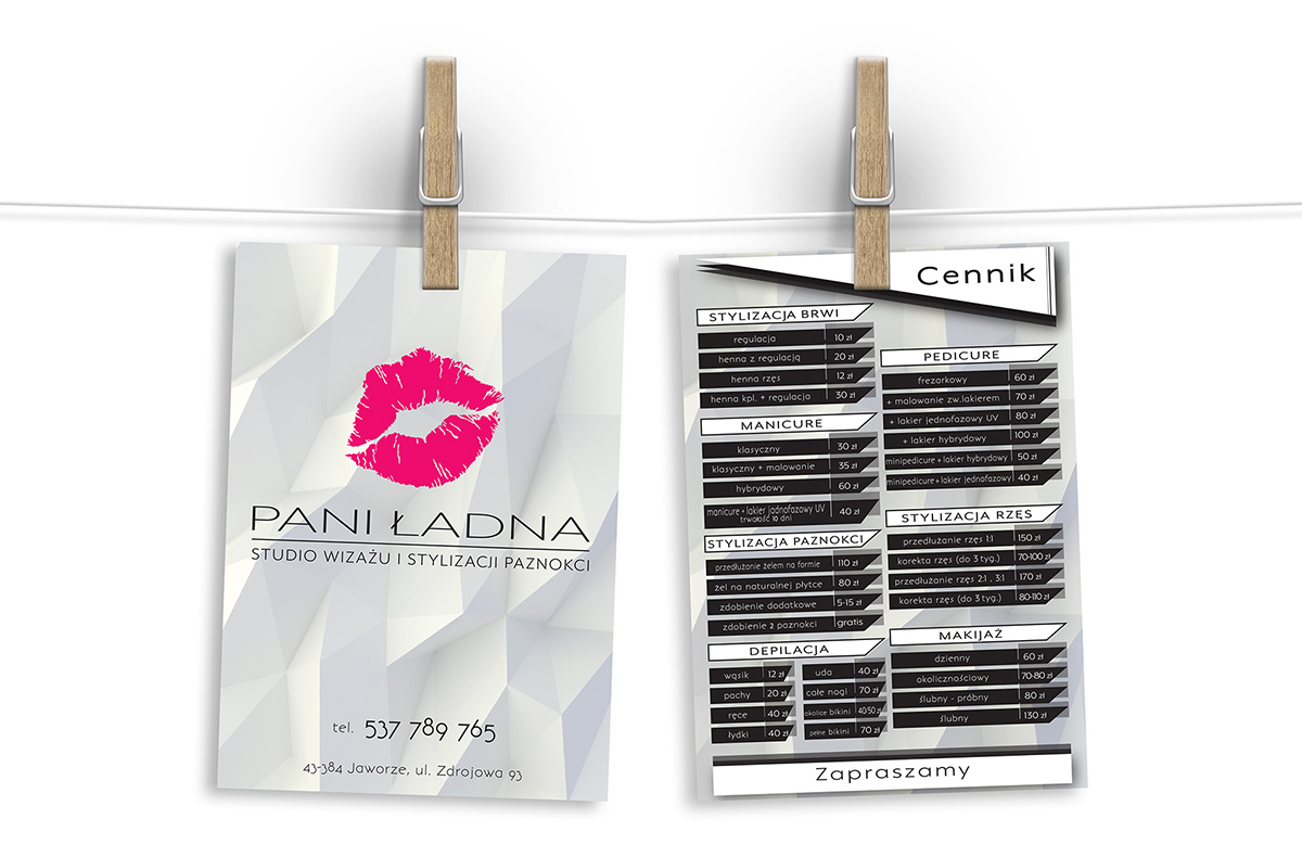
Cooperation with Mrs Maja, the owner of the Pani Ładna studio allowed us to "enter" the world of makeup and styling. We were asked to prepare advertising materials such as a price list for their services.
There is, however, a time in our lives that we wonder if what was created earlier reflects us at the moment. Mrs. Maja has stated that it is time to invest in the
business signed with her name and we are working on it at the moment. Creating a brand image from scratch takes time, but we are already working.
Under the brand name PANI ŁADNA there will still be a lot happening, soon. We invite you to follow the process.
